
The global children's TV channel Boomerang, a subsidiary of Cartoon Network that specialises in classic cartoons (such as Tom & Jerry and The Flintstones) with a more family friendly approach than the alternative, modern cartoons featured on its sister channel, has undergone a complete rebrand. The aim of the rebrand, from motion-led design studio Art&Graft, is to transform the channel into a colourful, “Fun-filled playground,” that is as inviting to teenagers and adults as it is for kids. All elements of the new look, including illustrations and animations, are being rolled out internationally throughout the year.
The aim of the rebrand is to transform the channel into a “Fun-filled playground”
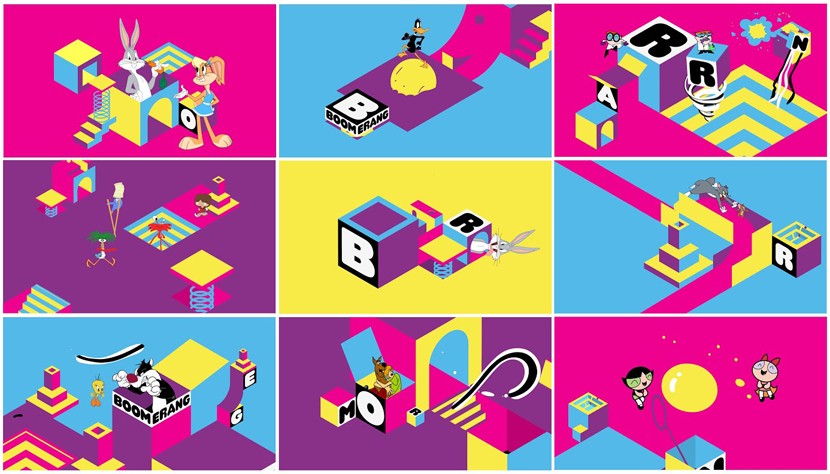
The Boomerang brand felt in need of a drastic update to help is not only share a visual language with Cartoon Network, but establish itself as a dominant player in the market. The channel, which was first launched in 2000, was rebranded by Turner Broadcasting in 2013 to appeal to both parents who grew up with the shows, and their kids who were coming to them free of nostalgia goggles. The approach Art&Graft took was to create a light-hearted, sensory world for the channel's eccentric cast of characters, with the isometric grid idea formed as a base upon which content could be layered and built on to create a playground environment.
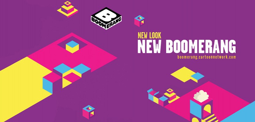
Boomerang Global Rebrand by Art&Graft
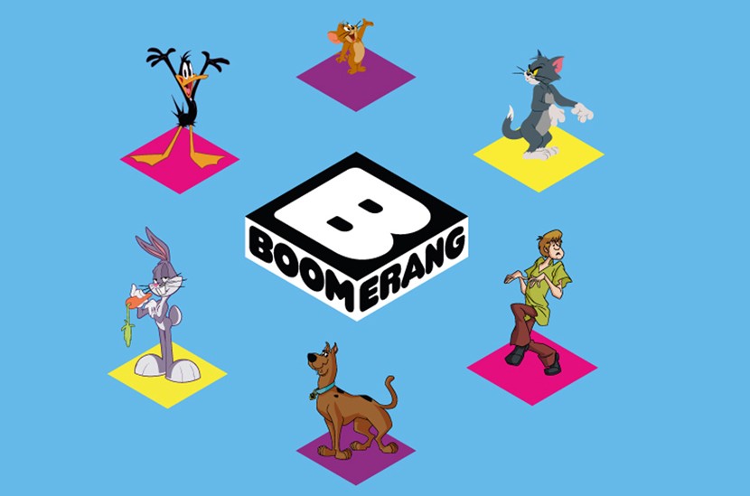
The most noticeable change in the branding has been the new logo, which swaps the old, blue, boomerang-shaped B sign for a cubic logo that sits on the overall isometric grid design. Mike Moloney, creative director at Art&Graft, said “The use of blocks relates to (Boomerang's) bigger brother Cartoon Network,” and allows the two brands to “Complement one another,” whilst letting Boomerang stand out as its own beast “With the use of rich colour and isometric grid.” He calls the playground concept “A place packed full of magic and wonder, where things are constantly revealed and appear in unexpected and entertaining ways.” Explaining the thought process behind which objects were chosen for the final design, Moloney said that “Very early on in the development process” they were discussing things that young children enjoy, ands tried to capture that in their designs. So “Objects appear and disappear like a magician at a kid’s party and kids’ favourite characters are chased through the scenes like a big game of hide-and-seek.”
Art&Graft created a light-hearted, sensory world for the channel's eccentric characters
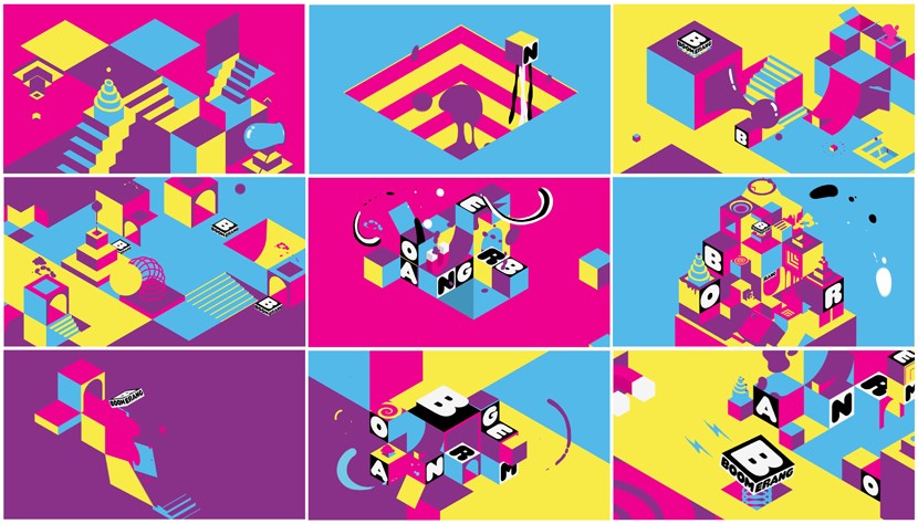
There is also a range of modular “Diamond Events,” that allow the designers to swap around characters and replace animations, which works on the global mandate, as it allows each region to bring their own spin to the brand by using their own characters and animation ideas. Lead creative William Mercer, said that “The Diamond Events are mini animations which populate the channel adding a fun and playful surprise.” He adds that the events “Allow modular elements to be utilised to create new combinations and add to a real diversity,” and that “Every brand element starts and ends with the logo acting as a button into the world, so you never know where it might take you.” The branding successfully launched in Latin America last September, and in Australia in November, and will continue to be rolled out across the USA, EMEA and APAC Networks throughout 2015. It was launched in the UK recently across all platforms, including television, print and online.